People who design the user interface is also known as UX in the technical field use color and cognitive psychology and other insights too. The ultimate goal is to make a website as appealing as possible so that more and more people tune in. UX designers also use psychology and insights to make users subscribe or direct them to some page that just boosts their business. The method used to do that involves Dark Patterns.
What are Dark Patterns Really?
Well, you may have seen this on a day-to-day basis, you try to find something on the Internet. You go to a website and before you could find something, you see these popups and subscription forms and all sorts of weird stuff. So, Dark Patterns are the interfaces that are designed in such a way that it guides users to something which they didn’t mean to look up for. This practice is very old and has been here for a while but the official term, “Dark Patterns” was first used by Harry Bringnull, a UX designer in 2010. This is a very technical method; it is observed that you are more likely to sign up for a service if you are in the middle of something interesting. You may have seen this, several websites use fancy clickbait and when you go to the article, you will only see one line and next, it says signup to continue reading. So, the timing with Dark Patterns is really essential. So, they are most likely to disturb you when you are in the middle of something important.
Some Common Examples of Dark Patterns
Confirm shaming
This is the worst technique; all they do is to emotionally attack you and try to lure into buying something or signup for something. A lot of fake charity, insurance, and social justice websites do this. They say, “You sure you do not care about your family?” then force you to buy insurance. Or, “You sure, you don’t want to help starving kids?” then give a donation. These are basically the methods that make you feel guilty if you don’t opt for their services.
Hidden Ads and Not Authorized Continuity of Services
If you are one of those guys who download movies from the websites, it is very likely you may have seen these dark patterns. These use colors and big buttons to lure you and then redirect somewhere else. For example, if you follow a download link, it has big green-colored “Download Now” buttons and if you are new then it is likely that you will click those buttons and get to another useless page. The real download links are often small icons in blue or other colors. Another type of Dark pattern is, companies offer you one-month free trails and take your card details and automatically start paid subscription from the next month. Without even informing you. So, it is very important that you read the renewal policy before signing up.
Alluring and Misleading Formatting
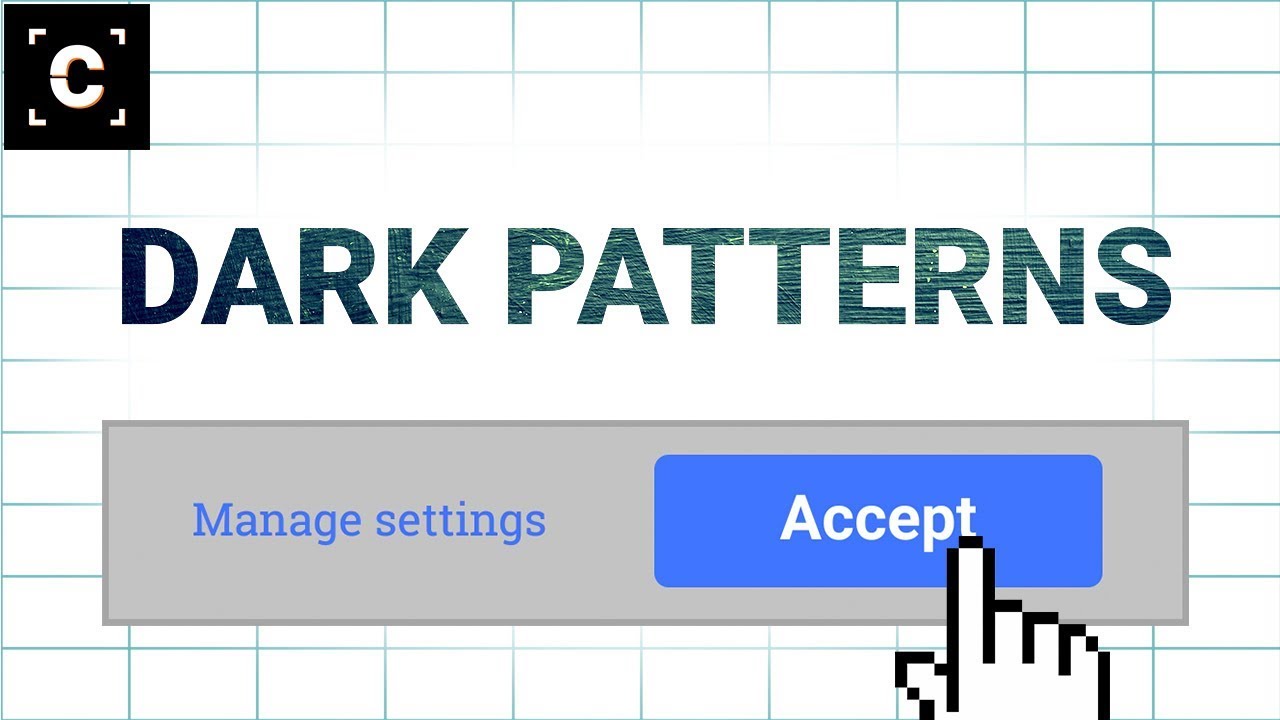
Websites use this for their cookie’s notifications. They use color combinations and images to manipulate you into clicking “Okay” or “Yes”. They would highlight Okay or Yes word so it’s more appealing to click and will leave the No word simple. There are other Dark Patterns too like hidden costs, trick questions and many other.
Conclusion
Dark Patterns are nothing noble and are very unethical. Content and resources should be the priority of any website. However, People are beginning to notice and call out companies for this unethical practice. LinkedIn was sued for $13 million for using dark patterns and exploiting the contacts and sending spams to contacts that users uploaded on their LinkedIn profiles. Microsoft also faced anger by users over the use of dark patterns. With the new update notification, even if you clicked on (X) to not install the update, it just started to download and install at the very moment. Companies should not do these practices as it was also observed that people tend to switch the sites if they feel annoyed by all these dark patterns. Users too, should stay away from these and try to avoid them as much as possible. Read More About
Internet Safety: How to Browse Internet Responsibly and SafelyEffects of Artificial Intelligence: All you need to know

